
Increasing the number of website visitors you convert—whether that’s a visitor to lead or visitor to sale—all comes down to your landing pages. Knowing how to build a good landing page, one that is optimized for a good user experience, targeted to your specific audience, and focused on a specific offer, is way more effective at converting leads than your homepage.
In fact, businesses with less than 10 landing pages convert at a 55% lower rate than businesses with 10-15 landing pages.
What does that show us?
It shows us that there’s a major benefit to having landing pages that are focused on addressing one problem, one need… so visitors can’t get distracted.
Leading your website traffic to an all-encompassing page (usually a website’s homepage or services page) is like casting a wide net. You’ll get more people to that page, but it won’t be as easy to convince them to take action.
Instead, custom landing pages allow you to be laser-focused on one thing at a time. This means that your potential customers land on a page that gives them what they’re looking for in that moment, making them way more likely to convert.
Want to get valuable insights for how you should be optimizing your website for conversion? Take our conversion quiz and we’ll give you actionable tips to start improving your landing pages in less than 5 minutes!
How Do I Know If My Landing Pages Are Leaving Money On The Table?
However, it’s not just about having landing pages, it’s about using them effectively to convert more leads. With a good landing page conversion rate, they can be a powerful lead generation tool for your business. But you have to do it right.
Before we get into how to improve landing page conversion rate, let’s talk about figuring out if your landing pages are working as hard as they can be.
Start by calculating your conversion rate. Your conversion rate answers one simple question: Out of all of the visitors to my site, what percentage of them are actually converting?
Conversion rate = Total # of conversions / total # of visitors
5% conversion rate = 100 conversions / 2,000 page visitors
A good conversion rate really depends on the industry, so you should look at the average conversion rate by industry to see how you compare. For a quick example, the average ecommerce conversion rate is around 2%, and that can be broken down further by niche. (Food ecommerce websites convert at 55% on average!)
A high conversion rate means that your landing page is designed well and is attractive to your target audience. The perceived value of your offer is enough to get website visitors to convert.
A low conversion rate indicates the opposite. There are many different factors that could be stopping your website visitors from converting.
This is where conversion rate optimization comes into play.
Increase Higher Ed Landing Page Conversions: Best Practices to Follow
What is Conversion Rate Optimization and Should We Do It?
Conversion rate optimization (CRO) is the process of figuring out the best ways to build your landing pages so they inspire website visitors to take action. CRO is an ongoing and constant process— you should always be tweaking and testing.
You can use best practices (some we’ll get into later in this post) to optimize your conversion rate and you can also use analytics from your website to inform the direction you take.
Google Analytics, for example, has a ton of different reports you can run to see how your website is performing. Gathering data there—behavior flow, where visitors came from, bounce rate, and more— give valuable insight into how your website is performing.
This tool also helps with conversion rate optimization because you can set conversion goals and see when they’re accomplished.
Other tools like heatmaps show you what exactly users are doing on each page. You can see how far visitors are scrolling or where they’re spending most of their time.
After looking at your webpages to see how they’re performing, the next part of conversion rate optimization is testing. Use the performance insights you’ve collected to help:
Say your Google Analytics report shows a high bounce rate on a certain landing page. And the heatmap tool you use shows that most users make it to a certain photo, hover there, and never go further.
Next, you would try new images to see if they perform better. Try two versions with an A/B test and see how your performance results change.
There are tools available to help you test out the different options. Some of our favorites are:
Want to get valuable insights for how you should be optimizing your website for conversion? Take our conversion quiz and we’ll give you actionable tips to start improving your landing pages in less than 5 minutes!
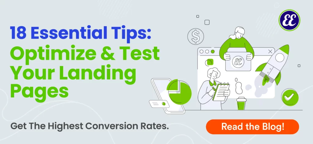
18 Tips for How to Create a Landing Page That Converts
There’s a lot that goes into a successful landing page, some of it going deep into the details of your marketing strategy. On the other hand, there are some simple things you can do to your landing pages that capture the attention of your visitors and drive them to take action.
In this post we’re going to cover some of our top tips for improving your landing pages so that you can start improving your conversion rate right now and bring in more money for your business.
1) Clarify Your Value Proposition
No matter what your company does, you probably have a few different messages that you’d like to get out. With so much to share, and many ideas for how to share it, it’s easy to get distracted.
Within all that noise, it’s your unique value proposition that’s going to be the best attention grabber. Use your unique value proposition as the highlight of your landing page. A noteworthy experience entices the visitor to learn more.
You need to be clear on what you offer and why you can do it better than your competitors. Ask yourself:
- What is unique about your product or service?
- What gaps in the industry do you fill? (AKA, why are you better than your competitors?)
- What pain point are you solving for your customers?
Only once you are clear on your value will you be able to communicate it to your website visitors. Create a message that resonates with your ideal audience, and drive them to take action on your offer.
2) Improve Your Offer To Improve Landing Page Conversion Rate
For your landing page to perform well, you have to have a solid offer.
Take a look at each of your offers and examine whether:
- Your target audience even wants what you’re offering
- There is an overwhelm of competition in the market
- You have both top of funnel offers for buyers just looking around and more intense offers for buyers who are ready to purchase
Your landing page might not be performing well simply because it’s not giving your audience something that is truly of value.
3) Strengthen Your Copy
Improving website copy is one of the easiest ways to boost conversion rates because it doesn’t require a lot of technical effort.
This doesn’t mean that writing good copy is easy, and it’s definitely something that you have to test and rewrite.
A general rule of thumb for writing landing pages that convert is to make them scannable. You can still include the information you need to include, but find ways to do so that don’t overwhelm the visitor.
A wall of text is going to scare people away immediately.
Your headline is everything! On average, 80% of people don’t make it past the headline.
Work on mastering the skill of writing headlines so that readers can get an understanding of the offer without having to read every word on your page. If they’re drawn in enough by an engaging headline, they’ll probably want to know more.
There are a few characteristics of headlines that are proven to improve conversion rates, but they don’t all work every single time. Either way, they’re good to know:
- Use Numbers: For example, “10 tips…” or “15 ways to…”
- Invoke Emotions: For example, “This Will Make You…” or “…Make You Cry”
- Use Around 8 Words: Headlines with 8 words may perform 21% better.
- Use Negative Words: Negative words perform 60% better than positive words in headlines.
- Be Clear & Specific: Headlines with no ambiguity perform well because they target a specific niche, industry, or person.
- Questions: Headlines phrased as questions open a conversation with your readers, and inspire them to want the answer. However, avoid yes or no questions!
- How-to: “How to” headlines imply that they’ll get actionable items to guide them to a solution.
- Address The Reader: It’s not about you! Headlines that resonate with readers help them visualize themselves benefitting from clicking. Use words like “You” and “Your” in the headline.
![[CRO] Conversion Rate Optimization: Find out how to improve your landing pages conversion rates with headlines](https://ellisonellery.com/wp-content/uploads/2022/02/headlines-that-convert-to-improve-conversion-rates-410x1024.png "Improving Landing Page Conversion Rates | Ellison Ellery Consulting")
Outside of just writing headlines that are eye-catching and concise, you have to know your audience and what motivates people to buy. Change your perspective from your own (ex; “What can I sell?”) to your customer’s (ex; “Why do I want to buy this?”).
If you focus too much on what you can push your website visitors to do, you may lose sight of what they actually need.
Write copy that:
- Provides value
- Creates an urgency to get your product or service
- Resonates with your audience by using a tone of voice and lingo that they know
Be strategic in the copy that you write for your landing pages, but also be prepared to test and try again. Optimizing for conversion is a work in progress!
4) Use The Right Images
Bad imagery directly affects your conversion results. Images not only grab the attention of website visitors faster, they also help them process information better.
The right photos help you connect with your audience, convey your ideas, answer their questions, and even trigger emotions. All of this contributes to a better overall user experience and lower bounce rates:
- People stay on the page longer and scroll further
- Interest is piqued to learn more
- Users are more likely to click-through
You can’t throw any images onto your landing page and expect that to increase your conversion rate. Just like every other aspect of CRO, testing is going to be your best friend. You have to run A/B tests to see what images resonate better with your audience.
Hint: the images that you think will perform the best, might not give you the highest conversion rate— doing conversion rate optimization testing is the only way to find out.
Here’s a quick rundown of the most important things to check for when optimizing your images for good conversion rates:
- Image file size and how it affects page speed and image quality (reduce your image sizes and you can use tools like Photopea or Squoosh)
- Is your landing page responsive to mobile? And, how do your images look on mobile vs desktop?
- Location of image; if the image is below the fold, you want to check a heatmap to see if visitors are even scrolling far enough to see it. Some heatmap tools include HotJar and Mouseflow.
- Purpose and meaning: does your image actually add to the value of the page or is it making the page cluttered and confusing? People associate images and words that are in close proximity with each other; don’t have a CTA or headline next to an irrelevant image.
The way you go about using images on your website has the power to make or break your conversion rate. There are so many different things to consider, and hopefully, these few tips get you started.
5) Test Landing Page Menus
Should you put a menu on your landing page?
Historically marketers have been told that there should be no menu on landing pages. The goal was to make the landing page have a singular focus, and prevent visitors from clicking away and getting distracted.
Adding extra links was considered counterproductive because it doesn’t support the landing page’s specific goal.
But does this always hold true?
Some visitors might want to know more. So without an easy navigation panel, you risk the chance of losing them entirely. (There’s no guarantee that they’ll go search your business separately).
Landing page navigation menus also give visitors a chance to convert on an offer that is of greater interest to them at that time. Or, they learn more about you and come back another day!
The best way to figure this out is through A/B testing.

6) Create A Visual Hierarchy
Because a landing page is made up of many parts—images, headlines, CTAs, forms, etc. —it can get really busy, really fast. If you think about each of these elements as their own section, instead of as one, flowing unit, the resulting user experience is clunky and disjointed.
Your landing page needs to flow nicely, or visitors might completely miss the purpose of your page and scroll right past your CTA.
This is where creating a visual hierarchy comes into play, and it starts by understanding how readers’ eyes typically track across a page.
The two most common ways users view a web page are in a:
- Z-shaped pattern: Top left to top right, then back to the left but traveling slightly downward, then back across left to right again
- F-shaped pattern: Top left to top right, then repeat this again, but lower down the page, then scan down the left from top to bottom
Putting important pieces of information at the angles of these lines can be effective because eyes will pause here to change direction.
These patterns are a great starting point for your landing page design.
It’s important to note that this is only a starting point, and there are other things to consider with your page design. Other elements on the page will influence where eyes go, such as white space and images.
7) Test Your CTAs
Test what type of CTAs you have on your landing pages! HubSpot ran a test to compare anchor-text CTAs versus end-of-post banner CTAs and guess which one converted better?
Results: Regular end-of-post banner CTAs contributed an average of just 6% of leads that the blog posts generated, whereas up to 93% of a post’s leads came from the anchor text CTA alone.
We were surprised to see this one and are adding it to our list of tests for ourselves and our clients! Who wouldn’t want to see that type of improvement?

8) Optimize For Mobile
Mobile traffic now makes up more than half of web traffic worldwide. So if you haven’t made your website look good on mobile yet, you’re almost certainly pushing people away from your content, and you’re most definitely losing out on leads and sales.
The conversion rate optimization you do for your desktop website won’t necessarily translate to your site’s mobile view.
If you’re using the same strategy on both desktop and mobile, you’re not doing enough. When calculating your conversion rate, make it a point to determine one for total visitors via mobile and one for total visitors via desktop.
If your mobile conversion rate is drastically different from your desktop, here are the first few places you should look:
- Speed: Speed is important everywhere, but even more so on mobile. People are usually on the go and want really quick loading experiences. Set up your webpage so content above the fold loads first.
- Automations & Triggers: Automatically triggering certain ads or emails based on actions is a great way to improve conversions, but mobile will be different than desktop. Pop-ups that would be fine on desktop can easily overwhelm mobile visitors, and Google directly told us that mobile pages with intrusive pop ups may not rank well.
- Design For Mobile: Mobile users are more distracted. They’re on the go and looking at a smaller screen. Give them enough information supported by quality videos, but make your CTAs crisp and clear, or they will go unnoticed.
- Forms: It’s tempting to get as much information as possible from a website visitor, but asking for too much can lead to getting nothing at all. Longer forms annoy busy mobile users. Make the forms easy to read, with fields that are large enough to click.
- Tip: Try a 2 part form that asks for key information before the rest, so you at least capture their contact info.

9) Social Proof
People don’t like to make purchasing decisions solely because a brand tells them to.
Whether someone is just learning about you or is on the verge of making a commitment, social proof can remove uncertainty and push them to take the next step. More customer trust = higher conversion rates.
According to Hubspot, 36% of the top landing pages have testimonials and 11% have reviews.
Customers perceive content generated by people other than the brand itself as more genuine and trustworthy. Real success stories and experiences help buyers feel more confident in a purchasing decision.
What are some trust indicators that you can use to improve your landing page conversion rate?
- Testimonials
- Reviews
- Logos of partner companies or who you’ve worked with
- Certifications you’ve attained
- User-generated content
- Third-party validation; ex) awards
Look at your landing pages from an outsider’s perspective. Better yet, ask an outsider what they think about you in terms of credibility and authenticity.
It can be hard to separate yourself from the knowledge you have about your site, but you need to put yourself in your customer’s shoes. Doing so can dramatically improve your chances of converting visitors!
10) Personalization
Personalization for website conversion rate optimization is pretty much what it sounds like—creating customized experiences for website visitors. Personalized content can unlock more engagement—in this case, click-throughs or sign-ups—because you’re speaking directly to the customer’s wants and needs.
Personalized CTAs convert 202% better than general CTAs.
CTAs that are targeted at a specific persona or step in the buyer’s journey:
- Speed up the sales cycle: Of all the visitors that come to your website, 96% of them aren’t ready to buy just yet. Personalization speeds up the process because it gives users a better experience the first time they visit and every time after that.
- Builds trust: People don’t want to buy products unless they feel like they connect with the brand. Personalization becomes the key to helping customers feel seen and understood.
Every business needs to connect to its customers in its own way. There’s no one-size-fits-all approach to personalization.
Here are a few things to consider for personalizing your landing pages:
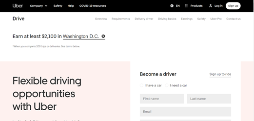
- Location: This can be extremely relevant if your goal is to get people to a certain location, but it can also help you relate to the unique experiences of individuals based on their environment.
On this landing page, Uber personalizes the experience by telling new drivers what they could expect to make based on their location.
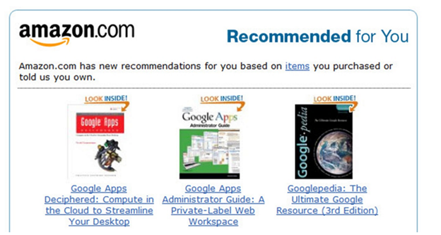
- Content: Returning visitors have engaged with your content before, so you can use their previous interactions to determine what you show them this time around. A great example of this is Amazon product recommendations.
- Paid ads and other sources: The referring source of the landing page matters. If you’re running a PPC campaign, the page should be optimized to include the same sales hook that brought them in on the ad.
At the end of the day, personalization increases engagement because the content is made for the viewer. It’s exactly what they’re looking for, so they’re going to engage, stick around, and ultimately convert into a lead.
11) Paid Ad-to-Page Relevance Can Increase Website Conversions
Do you run ads to your landing pages?
That’s a great way to get traffic to your offers, but you need those visitors to convert once they get there. If most of the traffic you’re getting from the ad is bouncing, it might be time to consider ad-to-page relevance.
If your landing page doesn’t deliver exactly what someone should expect, they’re not going to stick around.
Think about it this way:
If you clicked on an ad talking about the best burger place in town and were taken to a page for a commercial building architecture firm, there’s a 0% chance you’ll stay there.
Your ad has to match up with the landing page that it takes visitors to if you want to have a good conversion rate.
Lack of attention to this in the content marketing strategy is actually why 90% of Facebook ads fail. The offer isn’t good enough, whether it’s:
- not enticing
- misaligned to what your audience really wants
Your offer doesn’t need to be a 40% off coupon; an offer can be other things, such as to take a quiz.
The key categories of ad-to-page relevance:
Offer Value
Don’t underdeliver! Any amazing claim you make in your ad needs to be something that you actually offer. Catchy headlines that encourage people to click are fine, just make sure that you keep your promises.
Message
Keep your messaging consistent across your ads and landing pages. Many ads rely heavily on keywords and powerful ad copy to attract eyes. So when someone clicks one of these ads, they need to be brought to a landing page that they automatically recognize. This communicates to them that they’re in the right place and stops them from immediately leaving the page.
Offer-specific landing pages help with this; you can continue the conversation that you started with the customer in the ad by directing them to a very distinct page. If you ad offers a service for 20% off, the phrasing and keywords you use on the landing page need to be the same.
Design
Consistent designs between ads and landing pages help provide a seamless experience for your visitors. The landing page on the other side of an ad shouldn’t overwhelm or confuse site visitors with strikingly different images.
Keep the elements of the ad and the page it directs to consistent. This includes:
- Branding
- Colors
- Images
No surprises!
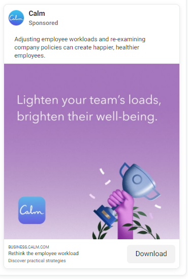
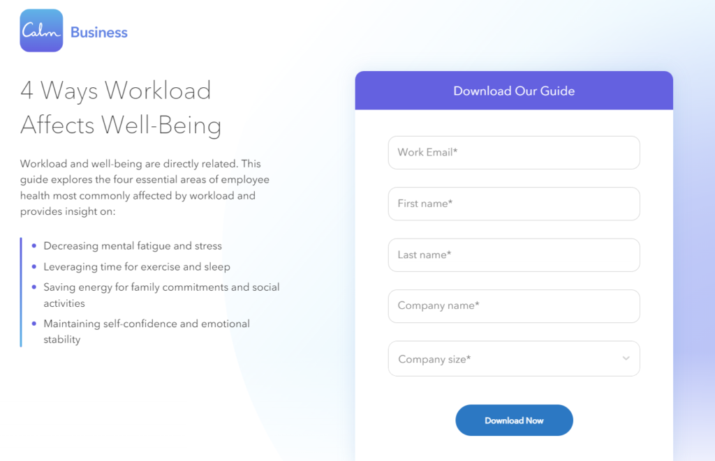
Take a look at this example from Calm. The Facebook Ad starts a narrative about employee workloads and continues this conversation on the landing page. Their CTA is to get users to download a guide to improve employee health in the workplace.
12) Length of your landing page
There is no one correct answer we can give you on the optimal length for your landing page. But looking at the page’s goal is a good starting point.
If you’re selling a trial run of your product or offering services, people need enough information to make a decision. No one is going to offer up money for something unless they know exactly what’s in it for them.
If your landing page is going to be long, make it worthwhile and relevant. What does the buyer need to know now?
Shorter landing pages have less information, meaning that there will be less distraction from your sign-up or submission form. But if you’re making a huge ask, it may not be enough information to convert a shopper.
Instead, shorter landing pages perform better when:
- The ask is low-risk; there isn’t any money involved. Ex) Whitepaper download
- Your main goal is capturing information for future lead nurturing purposes.
- The message is simple and powerful.
You often see shorter landing pages for low-risk offers such as free estimates or for lead magnets. The focus is “top-of-the-funnel,” so collecting information from those who are in the initial stage of the buyer’s journey. You’re not asking for their money, just their information that you can now use to nurture them.
Whether your landing page is long or short, it’s the content and the copy that really matter. Look at the greater picture of your marketing strategy and use that to inform the direction you take.
13) Fix Your Website Pop-Ups
Finding the perfect pop-up can be tricky! Pesky pop-ups are a major turn-off for website browsers, but effective ones can make a huge difference in your conversion rate.
Many pop-up forms convert about 1-3% of site visitors, but some people have seen success rates as high as 60%. How? A pop-up is irresistible if the offer is irresistible!
Given that, it’s probably safe to assume that you should take advantage of the power of pop-ups.
But if your pop-ups are doing nothing but annoying your site visitors, consider making these small tweaks that have a big impact.
- Timing is Everything in Life and With Website Pop-Ups
How quick are your pop-ups appearing for your website visitors?
The lowest-performing pop-ups are displayed between 0 and 4 seconds after someone lands on a page. We understand the urge to set an ad that displays quickly—it might seem like your best chance of grabbing a visitor’s attention.
But pop-ups that have the most success display after 4 seconds. Give your visitors a chance to even register where they’ve landed, or they’ll click out of the pop-up without giving it a second thought.
Marketers usually focus on capturing attention as fast as they can, but sometimes it’s not a race! Consider Wisepop’s example; this website converted 2x the amount of visitors by changing the pop-up trigger to later in the journey. Instead of popping up on the first page a user lands, they don’t see it until they navigate to a second page.
You can automate your pop-ups based on triggers other than the number of pages visited. Exit-intent popups increase conversion rates and are only activated when website visitors indicate that they’re about to leave.
Here are some exit-intent popups that get visitors to stay longer:
- Product recommendations related to what the visitor was looking at
- A valuable lead magnet offer, such as an ebook or checklist
- Discount codes or sale reminders
Focus on pushing a huge amount of value with your exit intent pop-up. That will convince visitors who are on their way out to stick around a little longer.
- Incentive
We hate to break it to you, but proclaiming that you have “great offers” or “the latest tips and hot topics” probably isn’t enough of an incentive. If you really want to use pop-ups to increase your conversion rates, you have to give people something valuable.
And, sadly your ebook may not be enough. Does anyone need to download and not read another ebook in 2022 and beyond?
Let’s look at pop-ups asking visitors to subscribe to your email newsletter. Tell them that they’ll get something amazing in exchange for it, and be specific. What can you offer as an incentive?
- Lead Magnets such as checklists, guides, or workbooks
- Discounts on the next purchase
- Free consultations
Intent matters for everything in content marketing, and pop-ups are no exception. Think about why your visitor came in the first place, and use that to get them to stay and hopefully convert.
3. Copy and Messaging
Even changing a few words in your pop-up could make the difference between whether visitors choose to click the CTA or take their leave. Try A/B testing different copy ideas—and we don’t just mean shorter vs longer.
Other ways to think about refining your copy:
- Use the right lingo: Are you targeting c-suite professionals in your industry? Make a reference that people in the know will understand. Is your audience of buyers a group typically characterized by a certain personality trait? Use that. But, don’t get too clever! Aim to be clear over cleverness 100% of the time.
- Get specific: If your offer isn’t clear, or you’re offering too much, your popup will just confuse people and they’ll move on. Make your offer clear, specific, and value-driven.
- Use emotion: Sales and product information are great, but what motivates people to buy or want more information is emotion and need. Can you make them feel like they’re missing out on something? Or relate to their situation?

14) Video Content Improves Landing Page Conversion Rates by 80%
Adding videos to your landing pages can help increase conversions by 80%.
Video content presents an opportunity to personalize and humanize yourself as a brand. Get in front of consumers and tell a story or explain what it is you can do for them. Even if you’re not face-to-face with the camera, you can use videos to break down complex topics or showcase how to use a product or service.
Customers are up to 84% more likely to make a purchase after watching a product video. Why? The videos:
- Give a better understanding of what the product can do for someone
- Build a relationship with the brand
- Show exactly how to use a product or service
Video content on your landing page needs to be intentional. To optimize your video content for conversions, think about:
- Your landing page’s purpose
- The offer displayed on it
- How visitors are led to the page
If you’re running an extensive social media campaign to drive traffic to a store’s landing page covering a specific product line, the on-page video should be a continuation of that story. A video about how the company got started might not be the best idea in this situation. Instead, a product tutorial or a customer testimonial might be better suited to improve conversions.

15) Think Human to Human
At Ellison Ellery, we’re all about bringing the human touch back to marketing. That’s because you’re selling to people, always. Even if you’re a B2B company!
That’s why it’s important to bring an aspect of humanity to your marketing and your landing pages. Trustworthy landing pages drive action, and you can build that trust with a friendly tone and a dash of personality.
You have a few seconds to convey two things clearly:
- Value
- Connection
Conveying value is a bit more tangible— with the copy you can tell a website visitor why you’re the best and what you have. What pain point are you solving with your product or service? Lead with that!
Connecting with your audience goes deeper than that, and involves tapping into both the conscious and subconscious of your visitors.
Some quick tips for making your landing pages more personal in order to drive conversions:
- Colors: Color psychology is real! We associate black and white with sophistication, and blue often inspires feelings of security. What emotion are you trying to instill in your viewers? Use color to help make that happen.
- Photos of people: Use photos of people to build trust with your audience. You don’t want to come across as a “faceless business” because no one wants to work with a company that’s cold and difficult to relate to. Think about who you’re showing in the images too: serious or smiling? Individuals or groups? Most studies show that photos of real people convert better than stock photos (up to 50% better) Have you seen how much personality Drift puts into everything? This is a big reason Drift is a category leader in the space. They differentiated using personality when selling in the B2B space.
- Your tone of voice and language: You’re not selling your product to people, you’re selling people on your product. For example, a list of product features isn’t going to build a human connection. Be friendly and focus on relatable topics and transfer tremendous value.
If B2C marketers thought like B2B marketers, Coca-Cola would market itself as “brown, fizzy, and sweet”. – Mimi Turner
Your B2B buyer is a real person who binges on Netflix, buys too much on Amazon, rides in Ubers and buys make-up or power tools online, and consumes too much content on YouTube or Facebook, or TikTok. This consumer doesn’t want you to bore them any more than a 19-year-old GenZer.
16) Clarity On Your Landing Pages
How clean and clear is your landing page?
Messy and overloaded landing pages don’t drive conversions, they just scare people away.
A headline that is focused on user experience uses just a handful of on-point words. Visuals, like photos, graphics, and videos do the rest of the work. A page that is too busy, with a lot of words to shift through distracts away from the value of your offer.
Concise CTAs also keep the user experience clear. Is your call to action specific enough and clear on what they will get? There should be no confusion as to what they’ll get if they click the button or fill out a form.
Your submit button shouldn’t say submit! That’s a process on the backend. The language on your button should mimic what they will receive after clicking the button.
Don’t overdo it on the form fields; make it quick and easy for users to get started or take the next step.
And finally, how clear is the pain point that you’re offering a solution for? Marketers tend to get caught up in the details and overthink how they can get the user to take action. Keep it simple and keep it clear. This is your problem, and this is how we’re going to solve it if you choose to stay with us.
17) Set Up a Sales Funnel
Are you using your sales funnel as a basis for your website and your landing pages? Not everyone who visits your website is in the same part of the funnel. Some are just learning about you and others are ready to make a purchasing decision.
Creating landing pages that address each stage of the buyers’ journey can be an extremely powerful way to increase your conversion rate.
If a website visitor isn’t ready to make a purchase, a product how-to might not be the content that’s going to get them to convert. When it comes to lead generation, buyers in the first stage, (the awareness stage) are going to be more engaged with lead-magnet style offers, like newsletters or checklists, or social media content. Be sure to save that lead generation guide, loaded with new lead gen strategies to try and perfect with visuals and how-to’s.
Think through your sales funnel and use that to inform the landing pages you need for your website, and how you bring traffic to them. With the right content, delivered to people at the right time, your chances of conversion increase.
Don’t forget once the form is submitted! What does your thank you page look like? That is your first touchpoint to begin furthering the sale. Don’t do a hard sale, but do start telling the prospect more about yourself, your company, and what happens next.
Next, is your communication sequence! What is the first email you are sending a prospective customer? Learn more about how to turn your email marketing into a performance powerhouse for your business in just a few steps!
18) Why You Need a Privacy Policy On Your Landing Page
Outside of just being required by some third-party tools, there are quite a few reasons to add a privacy policy to your landing page.
Privacy pages build trust with your audience and your buyers. They contain:
- what type of information you’re collecting
- what you’re going to do with the information you collect
- how cookies are collected
- how long you’ll hold their data
Basically, any important information about how a company plans to use and protect data from website visitors needs to be in a privacy policy.
What does this have to do with conversion rate optimization?
Website visitors don’t want to give their money or their trust to a page that doesn’t feel secure to them. So if you’re asking for their money or their trust, having a privacy policy is a must.
Plus, it’s common practice. If you’re not doing it, users who are concerned about your lack of a privacy policy can find someone else who is.
Confident copy and quality images can only get you so far—there’s a certain level of trust and credibility that customers need before they feel comfortable making a decision. The privacy policy builds your trust and credibility and can persuade them to sign up.
Pair this with other pieces of trust-building, like testimonials and elements of social proof, and you’ll improve both your credibility and your conversion rate.
Save Time And Money With CRO
There’s so much that you can do to create landing pages that attract your ideal audience and push them to take action! Our tips for how to increase landing page conversion rate will have you converting website visitors in no time…but you have to put in the work.
Get started by taking our 5-minute conversion rate optimization quiz that will identify some areas you can adjust to improve your landing page conversion rates.
Remember, optimizing landing page conversion rate is always a work in process that must be tested frequently.
Need help creating a landing page strategy that works for your business? Reach out to our team at Ellison Ellery Marketing & Growth Agency to learn how our services can build conversion rate optimization into your marketing strategy.