
How to best leverage landing pages to drive more enrollments
This post will explore how you can leverage landing pages to help balance paid media costs. If your landing pages did a better job of converting visitors, then the same ad spend could result in up to double the return on investment you’re currently seeing through increased interest and enrollment.
What are Higher Ed landing pages?
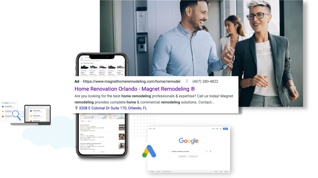
Landing pages refer to the pages people are sent to after clicking on a paid ad. If you send someone to your homepage from a paid media ad, this acts as the ad’s landing page.
However, using your homepage as a landing page is not a best practice. Dedicated landing pages will help you create a targeted, highly relevant experience for the visitor, increasing the chance of conversions.
Better performing landing pages differ from your standard webpage for a few reasons:
- They tend to be more segmented (focused on a single degree, campus location, modality) based on the content of the ad from which the visitors came.
- Landing pages are designed specifically for paid media conversion.
- Inquiry capture forms are prominently displayed, inviting conversion as quickly and easily as possible.
Unlike a website homepage, landing pages are customized to a specific campaign and guide visitors towards a call to action. In short, landing pages are designed for conversion rather than exploration.
Increase Higher Ed Landing Page Conversions: Best Practices to Follow
Why are Higher Ed landing pages so important?
However, before you jump into spending money on paid ads, you need to ensure you won’t be wasting the ad spend you invest.
Strong higher ed landing pages are the best way to ensure the money you spend to attract visitors to your website will result in enrollments further down the line.
The two important levers needed to get those costs down and inquiries up are:
1. Paid Media Strategy: Are you bidding on the right keywords using the best Google ads strategy? We are offering universities and colleges a free Google Ads audit.
2. Your higher ed landing pages need to be optimized for conversions.
Today, we’ll focus on the second lever.
Average landing page conversion rates
Across all industries, landing page conversion rates are 2.35% on average, but pages in the top 25% convert at 5.31% or higher.
Ideally, you want your landing page to be in the top 10%, which have conversion rates of 11.45% or higher.
Your landing page conversion rate for higher education should ideally be 10% or higher.
To get to this number, it’s important to take the time to create landing pages based on conversion rate best practices, and then to test variations of the pages to continue improving your conversion rates over time.
To find out where you currently stand when it comes to best practices, take our Conversion Rate Optimization Quiz and discover how well your landing pages are optimized for conversion.
Consider using tools like Hotjar or MouseFlow to determine how people engage with your landing page to help you improve your conversion rates by testing different variables on the page.
Learn more about how to best use heat mapping tools by watching our video.
Also, consider using Competitor research tools such as iSpionage. Learn more about this tool by watching our video.
Landing page relevancy to improve conversions rates
Did you know that the number of landing pages you produce can be an important indicator of success?
Businesses with fewer than 10 landing pages convert at a 55% lower rate than businesses with 10-15 landing pages.</span
This is because more landing pages tends to mean more targeted and segmented landing pages, creating a more relevant experience for the visitor.
For example, if a prospective student searches for “college in Orlando,” as an example, a paid ad would appear. This prospective student has a choice to click on the paid search ad or to scroll down half the page to where the organic listings are.
If the prospective student clicked on your ad, that link would then lead to a landing page. Ideally, this landing page would feature the programs offered at your Orlando location, along with messaging that speaks to being a “college in Orlando.”
On the other hand, if someone researches “how to pay for online degree”, then sending them to your “college in Orlando” landing page would not match up with the intent of that searcher.
This is relevancy and one of the most important qualities in improving conversion rates.
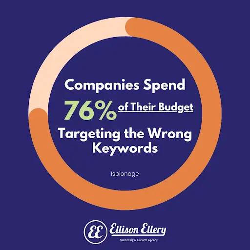
You’re trying to identify what people are searching for and create landing pages that match those topics.
Tools like Semrush and Ahrefs can be used to determine what people are looking for, but beware: studies have shown that some companies spend a whopping 76% of their budget targeting the wrong keywords!
That’s why it’s always important to keep an eye on what’s working and what isn’t and to create new pages as you expand your keyword strategy.
Keeping media costs down with high converting landing pages
As mentioned previously, a click for the keyword “entrepreneurship degree” can cost upwards of $51.
So if the average landing page converts at 2.35%, your inquiry can cost upwards of $2,100.
Most inquiries do not convert into enrollments, so your cost per enrollment could be approaching $40k depending on how well you convert these inquiries, and that’s just the ad spend.
That may seem bleak, but don’t despair! Below we break down the anatomy of a great landing page and what to test on your landing page to try to improve your conversion rates.
Be sure to download our higher ed landing page infographics.
Imagine what a simple increase in conversion will do for enrollment numbers and budgets: (Let’s see how the math works)
Let’s take the $51 per click from above. At a 9.7% click-to-inquiry conversion rate, the average for colleges and universities that’s about $526 per inquiry.
If 4.4% of those turn into enrollments (the median for the higher education sector), that student has cost you $11,955 in ad spend.
![]()
However, if you improve your landing page conversions to 15%, the cost per inquiry becomes $340.
If you convert the same 4.4% of those to enrollments, your cost per enrollment will become $7,727.
By simply improving your landing page conversion rate by 5.3%, you can save $4,228 per enrollment!
And if your average tuition price after discounts and scholarships is $10,000, that 5.3% improvement could be the difference between a good return on investment or a loss.
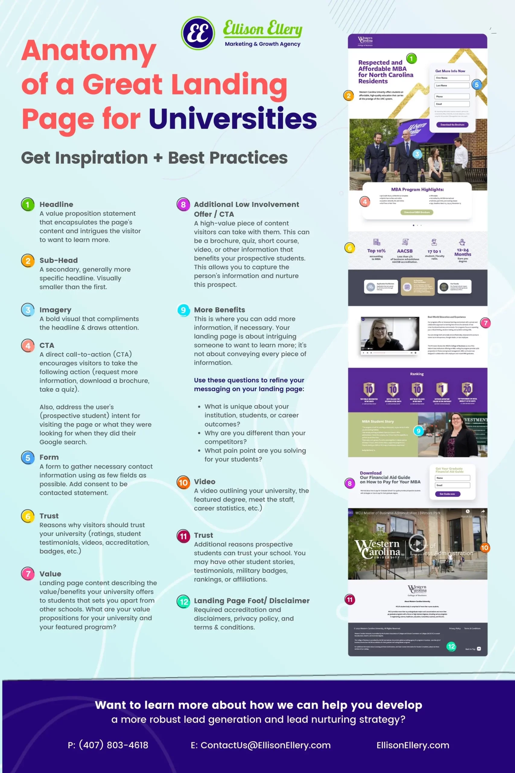
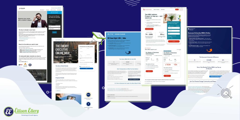
Understanding what makes a good landing page
Now that you understand why good landing pages are important, let’s take a look at what actually makes a good landing page. The most effective higher ed landing pages will always consist of a specific call to action (CTA), segmented messaging, and a clear conversion point.
Let’s take a look at the ideal landing page structure in more detail:
The key elements of an effective and higher-converting landing page include:
- Main headline (clear messaging)
- Call to action
- Highly relevant copy
- Lead form (ideally no more than 3-4 fields)
- Unique proposition (offer)
- List of benefits and differentiators
- High-quality imagery
- Video
- Social proof (testimonials, reviews)
- Mobile-first design
- Fast loading page elements
Your headline is everything! On average, 80% of people don’t make it past the headline.
Follow these four components for an engaging headline:
- Clarity
A headline should never be ambiguous, vague, or beat around the bush with metaphors.
- Urgency
Get right to the point while creating a sense of haste. Fear of missing out is a strong motivator.
- Relevance
The visitor should be able to identify straight away that they are in the right place.
- Searchability
Human visitors are the most important, but make sure your headline is keyword-rich as well so search engines (and ad platforms!) know it’s relevant to your target topic.
Headlines on Higher Ed Landing Pages Best Practices
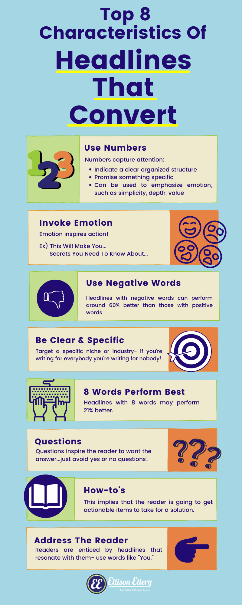
There are a few headline tips and tricks that are proven to help conversion rates, but they don’t all work every single time. Either way, they’re good to know:
- Use numbers: For example, “10 tips…” or “15 ways to…”
- Invoke emotions: For example, “This Will Make You…” or “…18 Months to a New Career”
- Use around 8 words: Headlines with 8 words may perform 21% better.
- Use negative words: Negative words perform 60% better than positive words in headlines.
- Be clear & specific: Headlines with no ambiguity perform well because they target a specific niche, industry, or person.
- Questions: Headlines phrased as questions open a conversation with your readers, and inspire them to want the answer. However, avoid yes or no questions!
- How-to: “How to” headlines imply that they’ll get actionable items to guide them to a solution.
Address the reader:
Supporting Copy on Your Landing Page
People don’t read much anymore, especially when browsing online. In fact, you’re likely not actually reading this, but rather skimming the copy.
Supporting copy can encompass your unique proposition, your program or university benefits, and other needed information.
It’s important to add value to your landing page with each word while maintaining a standard message so that your words don’t fall on deaf ears (so to speak).
However, it’s also important to make sure your copy is laid out in a way that makes it easier to skim.
Outside of just writing eye-catching and concise headlines, you have to know your audience and what motivates people to buy. Change your perspective from your own (ex; “How can I get students to enroll?”) to your future students (ex; “Why would I enroll here?”).
Need help with your value propositions? Find out how to write a higher ed value proposition in 6 steps.

Use these questions to refine your messaging on your landing page:
- What is unique about your institution, students, or enrollment?
- Why are you different than your competitors?
- What pain point are you solving for your students?
Higher Ed landing pages: Images and Videos
The right photos help you connect with your audience, convey your ideas, answer their questions, and even trigger emotions. All of this contributes to a better overall user experience and lower bounce rates.
Best practices for optimizing your images to help your conversion rate:
- Use tools like Photopea or Squoosh to resize your images to the exact right size to optimize loading time and user experience.
- Make sure your landing page, including all of your images and videos, are responsive to mobile, as that’s how many of your visitors will discover you.
- Make sure you have relevant, eye-catching visuals above the fold, meaning visitors don’t need to scroll to see them.
- Make sure your images and videos are adding value by increasing relevance, highlighting the call to action, or helping convey your value proposition.
Add videos to your landing pages to improve conversion rates
-
- Speed: Speed is important everywhere, but even more so on mobile. People are usually on the go and expect pages to load quickly. If your page is loading too slowly on mobile, you may need to change hosting, remove chat, and remove images to improve your load speed. You can also use tactics like “lazy loading” so that elements load as the user scrolls, rather than trying to load the entire page at once, but make sure you test that it’s keeping up.
-
- Design: Mobile users are more distracted. They’re on the go and looking at a smaller screen. Make sure your designs are attention-grabbing and high-contrast so mobile users want and are able to engage with them.
-
- CTA: The number one most important element on your mobile landing page is the call to action. If a mobile visitor can’t see and act on it straight away when they arrive on your page, you’re quite likely to lose that visitor without a conversion.
-
- Forms: It’s tempting to get as much information as possible from a website visitor, but asking for too much can lead to getting nothing at all. Longer forms annoy busy mobile users and can be hard to complete, so make the forms easy to read, with fields that are large enough to click.
Here are some mobile form tips:
-
-
- Try a 2-part form that asks for key information before the rest, so you at least capture their contact info.
- Test your form on mobile devices.
- Ensure your form can be easily prepopulated.
- If you have a captcha on your form, test it regularly to ensure it works and doesn’t create a poor mobile experience. If it does, consider turning it off on mobile devices.
-
Privacy policy and Terms and Conditions best practices
Similar to other elements like social proof and imagery, clear privacy information and terms build trust with your audience. Outside of being a requirement for some third-party tools, there are quite a few reasons to add a privacy policy and terms and conditions to your landing page.
Typical privacy policies contain:
-
-
- What type of information you’re collecting
- What you’re going to do with the information you collect
- How cookies are collected
- How long you’ll hold their data
-
Depending on your website, you may also have a Terms and Conditions page. When it comes to big financial decisions, especially higher education, prospective students are also consumers, and clearly signposting your Terms and Conditions creates consumer confidence.
Usually, these are linked in the footer of a page, as well as in cookie banners and privacy text on forms. As with all elements, be sure to test how well your cookie banners perform on mobile and how they might impact the user experience.
The importance of CRO (conversion rate optimization)
There’s so much that you can do to create landing pages that attract your ideal audience and push them to take action! With so many elements at play in determining your conversion rates, it’s important to have a clear conversion rate optimization (CRO) strategy in place.
Get started by taking our 5-minute conversion rate optimization quiz helping you identify some areas you can quickly adjust to improve your landing page conversion rates.
Our tips for how to increase landing page conversion rate will have you converting website visitors in no time, but you have to be ready to play the long game.
Remember, optimizing landing page conversion rate is always a work in process that must be tested frequently.
How about a “thank you”
Last but not least, create a great thank you page. When visitors fill out a form, you can choose to display an in-line thank you message or redirect them to another page. Be sure to create a discreet thank you page instead of an in-line thank you message. This will help you with tracking your conversion rates, along with other benefits:
-
-
- Continue the user journey for prospective students, offering more committed calls to action like booking a call with your admissions team;
- Ensure that your messaging on the thank you page is specific to the topic that brought them to your landing page, increasing relevance even after the conversion; and
- Offer even more social proof and resources without cluttering your landing page.
-
Then, once your landing pages are optimized and the inquiries start flooding in, be sure to check out our blog on how to get more of those inquiries to turn into enrollments through lead nurturing. Thank you pages play a key role in this.
How to get started
As you have been reading, there is a lot of work and strategy that goes into creating, optimizing and maintaining effective landing pages that compensate for the high cost of paid media.
The great news is that, if you need help getting started, refining, or taking a deeper dive, you’re already in the right place. Our team of expert marketers can help!
We help universities and colleges clarify their value proposition, messaging, and strategy so they can attract, convert, and scale more effectively.
We take this know-how and apply it to create great converting landing pages, and running high-performing paid media campaigns.
It all starts with connecting with your prospective students in a meaningful, human way. Plus we have the experience and expertise to execute digital marketing campaigns with technical know-how, creativity, grit, and empathy.
Interested in learning how we can help you develop a conversion rate optimization strategy for your school? Reach out to our team at Ellison Ellery to help.
 a c
a c

Two out of three people now get most of their information from video; it’s proven to hold attention better than static imagery. More still, nine out of ten wanted more video content from companies and online brands.
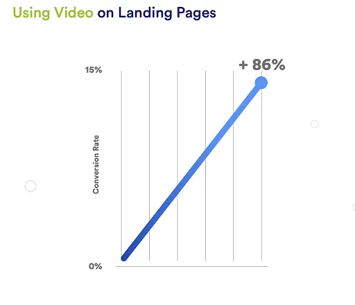
Some more compelling stats for you: 80% of video marketers say that video has directly increased sales; 30% of top landing pages use video content; and video has been shown to increase conversions by 86% (think of what that would do to your ROI!).
Based on this evidence, it’s pretty clear that video is a powerful medium to explore. If you have the capacity to create video content, it’s worth doing to help your landing pages as much as possible.
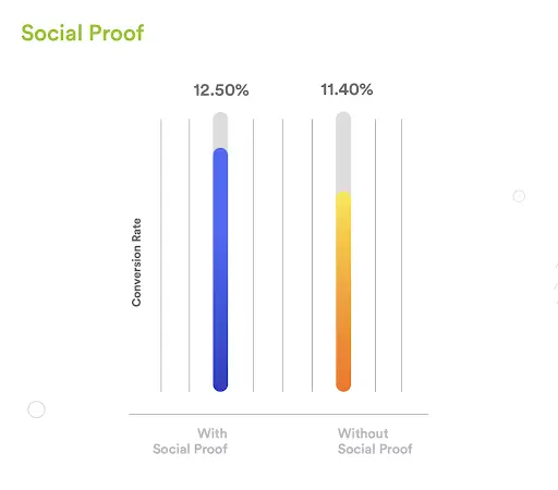
Adding social proof to your Higher Ed landing page
People don’t like to make purchases or commitments solely because a business or brand tells them to. Whether someone is just learning about your school or on the verge of committing social proof can remove the uncertainty and push them to take the next step. The idea is to create a sense of credibility through social psychology and easing the worries of distrustful visitors.
According to Hubspot, 36% of the top landing pages have testimonials. Landing pages with social proof have a conversion rate of 12.5%, whereas pages without social proof have an 11.4% conversion rate.
There are several different types of social proof, including:
- Testimonials
- Reviews
- Logos of partner companies
- Certifications
- User-generated content
- Third-party validation like awards or endorsements
Look at your landing page from a prospective student’s perspective. Put yourself in your visitor’s shoes.
What kind of social proof would be the most compelling for them?
What would best support your value proposition?
Finding the answers to these questions and incorporating social proof accordingly can dramatically improve your conversion rates.
Call to action (CTA)
Much like your headline, your call to action (CTA) needs to be clear and specific while creating a sense of urgency that drives visitors to action. Unlike other elements on your page, however, CTAs are best used one at a time. Too many instructions can confuse your visitors and lead to fewer conversions as a result.
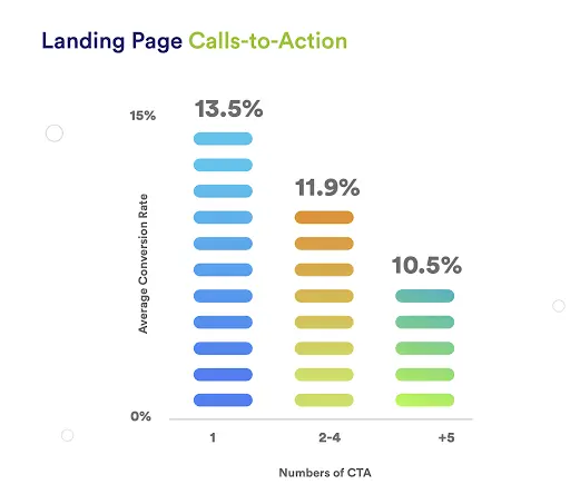
According to Unbounce, landing pages with only one CTA convert at an average of 13.5%. Adding just one more CTA drops the conversion rate to 11.9%. Meanwhile, pages with 5+ CTAs convert at an even lower rate of 10.5%.
The CTA on your landing page depends on the page’s purpose; are you collecting general inquiries for a specific program?
Offering a piece of gated content like a programmatic guide or financial aid guide/video? Whatever the reason is that the visitor has come to your page, that should dictate your call to action.
Visual hierarchy & page length
Attention is a precious commodity, one that’s in increasingly high demand. Losing a prospect’s attention is a thousand times easier than keeping it, so it’s best to get to the point and ensure your page is structured for the ideal user experience.
As mentioned, most web visitors won’t actually read your page in detail but skim for key information. Building a page that caters to this behavior starts by understanding how readers’ eyes typically track across a page. The two most common ways users view a web page are:
-
- Z-shaped pattern: People’s eyes follow a “Z” shape when skimming. Eyes go to the top left to top right, then back to the left but traveling slightly downward, then back across left to right again.
-
- F-shaped pattern: Other people’s eyes follow an “F” shape when skimming. Eyes go to the top op left to top right, then repeat this again, but lower down the page, then scan down the left from top to bottom.
Other elements on the page will influence where eyes go, such as white space (negative space) and the placement of other elements (like your call to action). Use this knowledge to draw attention to your landing page’s most important modules and what you want your landing page visitors to do (e.g. fill out a form).
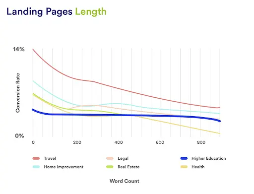
As you can see from the graphic above, heavy text causes conversion to drop almost immediately (before the page even reaches 200 words!), and it’s all downhill from there.
The best landing pages typically feature a striking image, a single clear call to action, and as few words as possible.
Additionally, instead of large blocks of text, try using bullet points, graphics, and images to communicate your point.
Of course, your visitors may behave differently than expected based on where they have come from, their age, and other factors. These variations from the norm can be difficult to anticipate. This is why you must test, test, test!
Optimizing for mobile
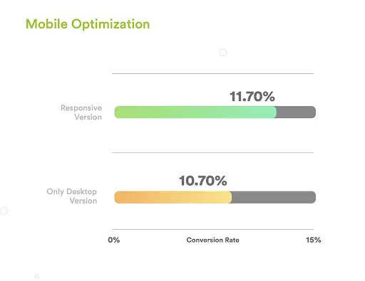
Smartphones have made a HUGE impact on how we experience the internet. Especially amongst younger segments, it’s not unusual for the vast majority of landing page traffic to be from mobile devices.
Today, 63% of Google’s organic search traffic comes from mobile devices. So if your website isn’t properly optimized for mobile, you’re going to miss out on prospective students! 
It’s no surprise that mobile optimization can greatly impact your conversion rates. Landing pages optimized for mobile traffic have an average conversion rate of 11.7%, while desktop-only landing pages lag behind at 10.7%.
Mobile traffic now makes up more than half of web traffic worldwide. So if you haven’t made your website and landing pages look good on mobile yet, you’re almost certainly pushing people away from your content, and you’re most definitely losing out on inquiries and enrollments.
If your mobile conversion rate is drastically different from your desktop, here are the first few places you should look:
-
- Speed: Speed is important everywhere, but even more so on mobile. People are usually on the go and expect pages to load quickly. If your page is loading too slowly on mobile, you may need to change hosting, remove chat, and remove images to improve your load speed. You can also use tactics like “lazy loading” so that elements load as the user scrolls, rather than trying to load the entire page at once, but make sure you test that it’s keeping up.
-
- Design: Mobile users are more distracted. They’re on the go and looking at a smaller screen. Make sure your designs are attention-grabbing and high-contrast so mobile users want and are able to engage with them.
-
- CTA: The number one most important element on your mobile landing page is the call to action. If a mobile visitor can’t see and act on it straight away when they arrive on your page, you’re quite likely to lose that visitor without a conversion.
-
- Forms: It’s tempting to get as much information as possible from a website visitor, but asking for too much can lead to getting nothing at all. Longer forms annoy busy mobile users and can be hard to complete, so make the forms easy to read, with fields that are large enough to click.
Here are some mobile form tips:
-
-
- Try a 2-part form that asks for key information before the rest, so you at least capture their contact info.
- Test your form on mobile devices.
- Ensure your form can be easily prepopulated.
- If you have a captcha on your form, test it regularly to ensure it works and doesn’t create a poor mobile experience. If it does, consider turning it off on mobile devices.
-
Privacy policy and Terms and Conditions best practices
Similar to other elements like social proof and imagery, clear privacy information and terms build trust with your audience. Outside of being a requirement for some third-party tools, there are quite a few reasons to add a privacy policy and terms and conditions to your landing page.
Typical privacy policies contain:
-
-
- What type of information you’re collecting
- What you’re going to do with the information you collect
- How cookies are collected
- How long you’ll hold their data
-
Depending on your website, you may also have a Terms and Conditions page. When it comes to big financial decisions, especially higher education, prospective students are also consumers, and clearly signposting your Terms and Conditions creates consumer confidence.
Usually, these are linked in the footer of a page, as well as in cookie banners and privacy text on forms. As with all elements, be sure to test how well your cookie banners perform on mobile and how they might impact the user experience.
The importance of CRO (conversion rate optimization)
There’s so much that you can do to create landing pages that attract your ideal audience and push them to take action! With so many elements at play in determining your conversion rates, it’s important to have a clear conversion rate optimization (CRO) strategy in place.
Get started by taking our 5-minute conversion rate optimization quiz helping you identify some areas you can quickly adjust to improve your landing page conversion rates.
Our tips for how to increase landing page conversion rate will have you converting website visitors in no time, but you have to be ready to play the long game.
Remember, optimizing landing page conversion rate is always a work in process that must be tested frequently.
How about a “thank you”
Last but not least, create a great thank you page. When visitors fill out a form, you can choose to display an in-line thank you message or redirect them to another page. Be sure to create a discreet thank you page instead of an in-line thank you message. This will help you with tracking your conversion rates, along with other benefits:
-
-
- Continue the user journey for prospective students, offering more committed calls to action like booking a call with your admissions team;
- Ensure that your messaging on the thank you page is specific to the topic that brought them to your landing page, increasing relevance even after the conversion; and
- Offer even more social proof and resources without cluttering your landing page.
-
Then, once your landing pages are optimized and the inquiries start flooding in, be sure to check out our blog on how to get more of those inquiries to turn into enrollments through lead nurturing. Thank you pages play a key role in this.
How to get started
As you have been reading, there is a lot of work and strategy that goes into creating, optimizing and maintaining effective landing pages that compensate for the high cost of paid media.
The great news is that, if you need help getting started, refining, or taking a deeper dive, you’re already in the right place. Our team of expert marketers can help!
We help universities and colleges clarify their value proposition, messaging, and strategy so they can attract, convert, and scale more effectively.
We take this know-how and apply it to create great converting landing pages, and running high-performing paid media campaigns.
It all starts with connecting with your prospective students in a meaningful, human way. Plus we have the experience and expertise to execute digital marketing campaigns with technical know-how, creativity, grit, and empathy.
Interested in learning how we can help you develop a conversion rate optimization strategy for your school? Reach out to our team at Ellison Ellery to help.
a c